

Logo
Six Zs, one centre: travellers from every direction, meeting in one place. The freedom of the road in one mark — use it the same way, everywhere.
Master files
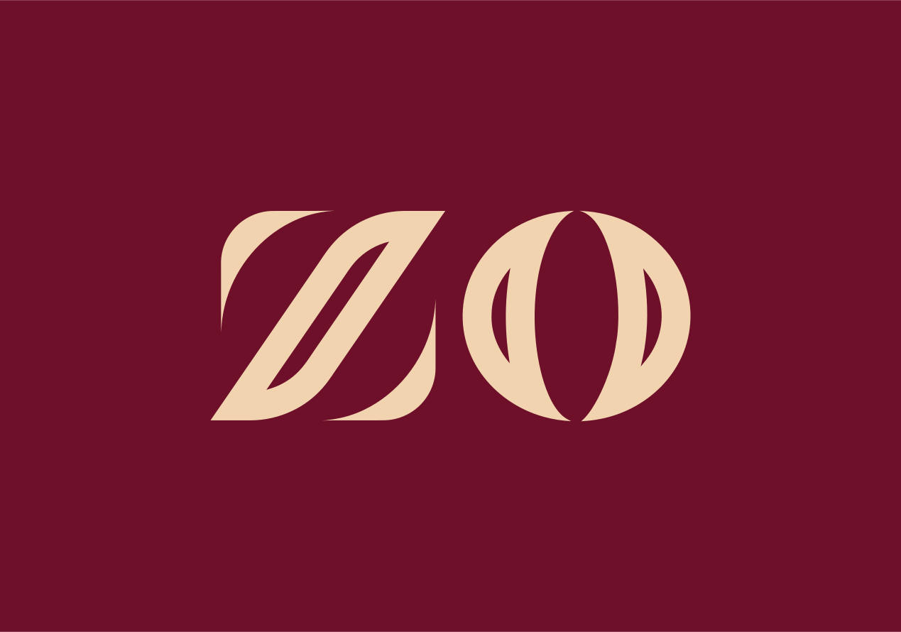
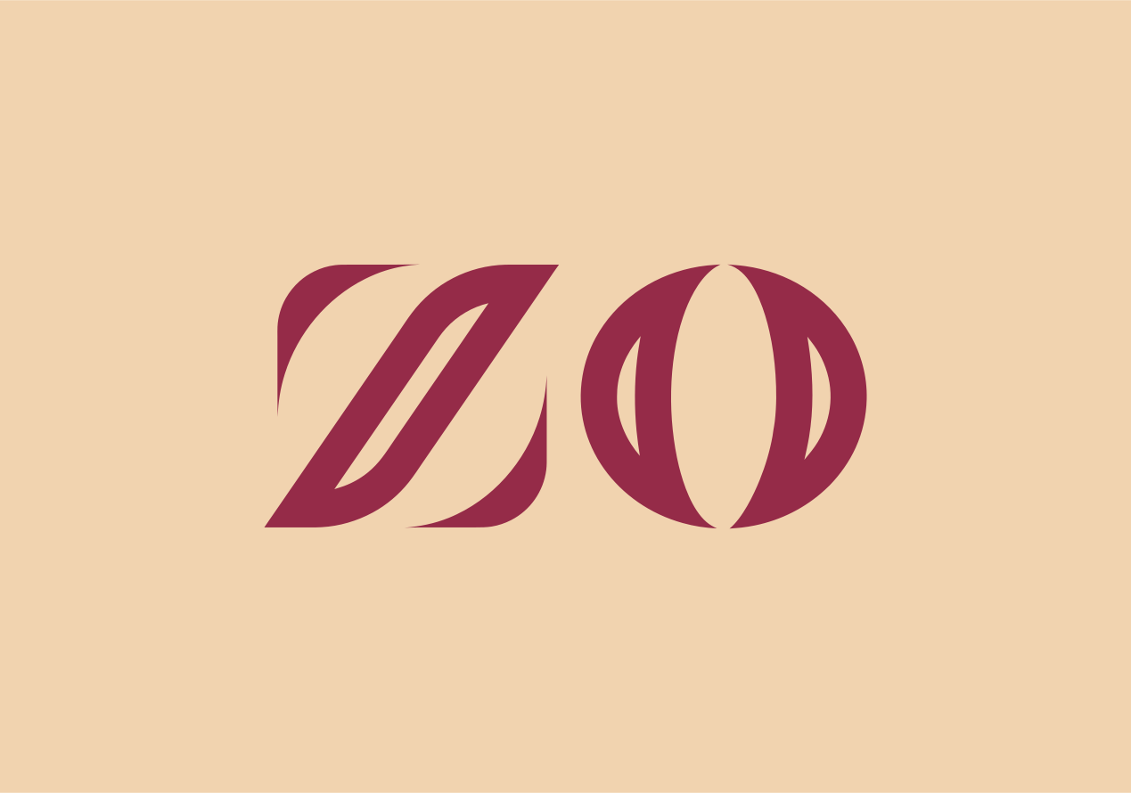
Rebuilt from the Brand Manual. The symbol is six identical Z strokes placed at exact 60° steps (the book's artwork was placed by hand, 58–61°); the wordmark and lockups use the manual's own outlines and proportions. These are the files to use — everything else on the site is drawn from them. Zo Selections' own mark is vectorised from its brand kit (the Figma export of 5 October 2026) and keeps its own maroon and cream.


Zo Selections
Its own space: colours, patterns, type and kit →Its own brand, in its own maroon and cream: never on Zostel's colours, never beside the six-Z symbol.
All colour variants (37 files)
 zostel-lockup-horizontal-black
  zostel-lockup-horizontal-grey
  zostel-lockup-horizontal-orange
  zostel-lockup-horizontal-white zostel-lockup-horizontal
  zostel-lockup-vertical-black
  zostel-lockup-vertical-grey
  zostel-lockup-vertical-orange
  zostel-lockup-vertical-white zostel-lockup-vertical
  zostel-symbol-black
  zostel-symbol-grey zostel-symbol-small
  zostel-symbol-white zostel-symbol
  zostel-wordmark-black
  zostel-wordmark-white zostel-wordmark
  zo-mark-black
  zo-mark-currentcolor zo-mark-disc-beige
  zo-mark-disc-grey zo-mark-disc
  zo-mark-grey
  zo-mark-white zo-mark
  zo-selections-lockup-currentcolor zo-selections-lockup-on-cream
  zo-selections-lockup-white zo-selections-lockup
 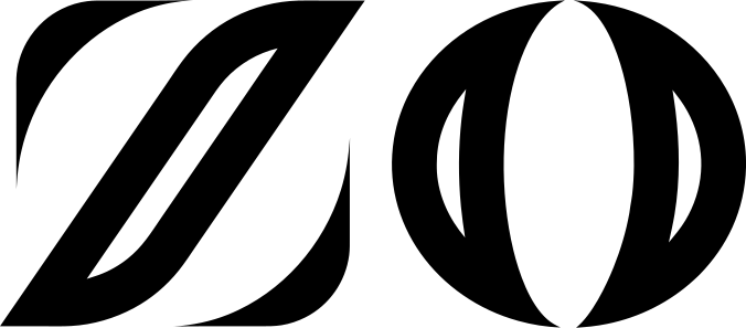 zo-selections-monogram-currentcolor zo-selections-monogram-on-cream
  zo-selections-monogram-white zo-selections-monogram
  zo-selections-sparkle-currentcolor
  zo-selections-sparkle-white
  zo-selections-sparkle
 One family, two dialects, one culture layer
Both brand books stay in use. Each brand speaks one dialect; all of them share the Zo World culture layer — the \z/, the Zo keyboard and the culture symbols.
Zostel dialect
Zostel · Zostel Plus · Zostel Homes
From the Zostel Brand Manual: the six-Z symbol, Futura, LIVE IT. NOW, mitred lines, amenity roundels, the landscape palette.

Zo dialect
Zo Trips · Zo Villas · Zo Houses
From the ZO Rooms guide: the ZO monogram, rounded type, round-cap duotone icons, curved headers and trust lines.
Zo Selections has its own theme, its own mark and its own colours.
Open Zo Selections → Zo World culture layer
Shared by every brand
The \z/ — a person with arms up. Reactions, culture symbols, Zobu characters, quests and badges: the community language that travels with the traveller.
Open the Zo keyboard →Primary Logo
Full logo — vertical lockup
Full logo — horizontal lockup
Logo Symbol
The symbol can be used independently as a brand mark when space is limited or when the Zostel name is already established in context.
Orange on Light
Grey on Light
White on Orange
White on Dark
Wordmark
The wordmark uses expanded letter spacing for a distinctive, premium feel. Never recreate or modify the wordmark — always use the official version.
Grey Wordmark
White on Orange
White on Dark
The symbol in motion
Zostel moves the way the symbol is built: six parts, 60° steps, 60 ms apart — depart quick, travel steady, arrive soft. Every move the brand makes is on Illustration & motion.
Splash and intro: the six Zs arrive from their six directions and lock with one 60° click. Plays once; hold the last frame.
Pull: the Zs grow out one by one as you pull (scrub it with the finger). Refresh: 60° clicks, looped while loading. Done: the Zs leave.
Clear Space
Maintain minimum clear space around the logo equal to the height of the symbol. This ensures the logo has visual breathing room and remains impactful.
Colour Usage
The logo should only be used in approved colour combinations to maintain brand consistency.
2-Colour (Primary)
Use on white backgrounds only
1-Colour Options
For special applications
Usage Guidelines
Do
- Use the logo at approved sizes (minimum 24px symbol)
- Maintain clear space around the logo
- Use approved colour combinations
- Use white/transparent backgrounds
Don't
- Stretch or distort the logo
- Change the logo colours
- Add effects like shadows or gradients
- Recreate or modify the wordmark
- Place on busy or coloured backgrounds (2-colour version)
Download Logo Assets
Get all logo files in SVG, PNG, and other formats for your projects.
Download All Logo Files