





Zostel
Brand

Zo Selections

Where good company gets a great setting: signature hotels, resorts and retreats, each picked for comfort, design and a warm social vibe.

Live the Art of Escape.

Zo Selections is Zostel’s collection of social premium hotels, resorts and retreats. It is its own brand within the family, with its own maroon and cream, its own mark and its own patterns, all drawn from its brand kit. Zostel stands behind it in words, as “Zo Selections by Zostel”, never in the mark: no Warm Orange, no six-Z symbol and no Futura on a Zo Selections surface.

Its voice speaks lower than Zostel’s, in sentence case, and ends with a full stop. The kit’s own lines:

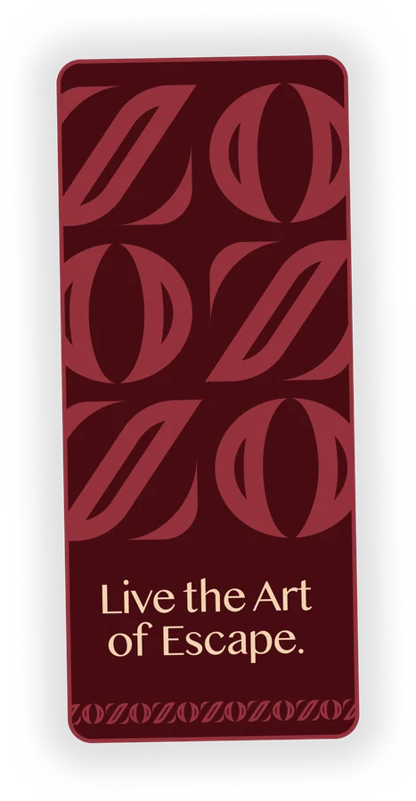
  • Live the Art of Escape.
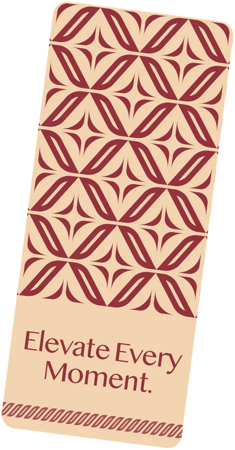
  • Elevate Every Moment.
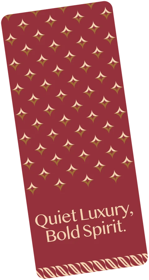
  • Quiet Luxury, Bold Spirit.
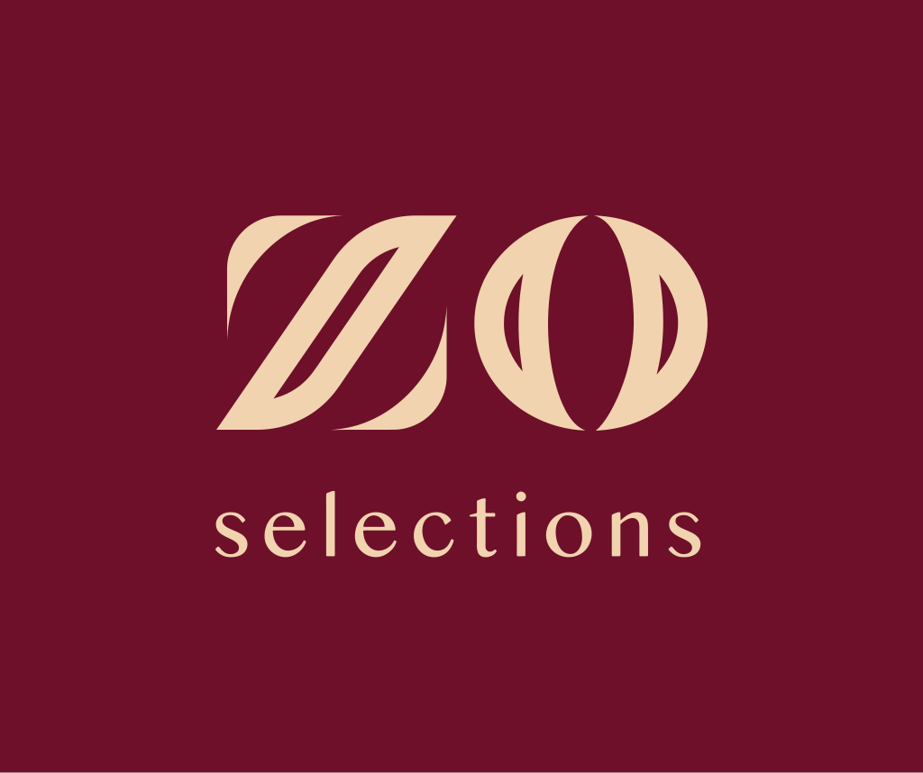
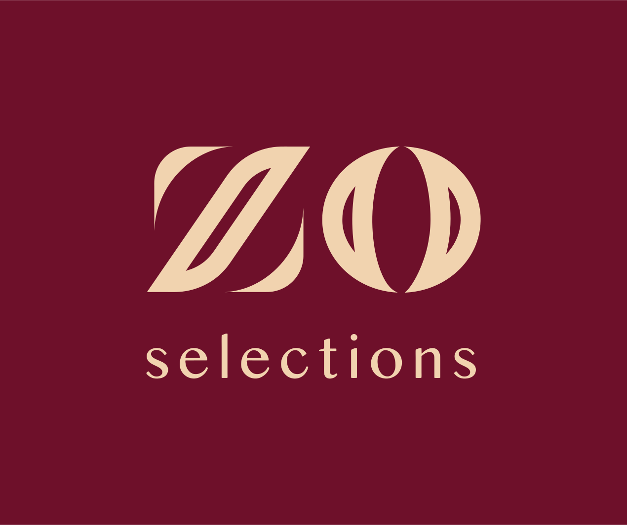
The Zo Selections lockup: the ZO over the word selections, in cream on maroon

The mark

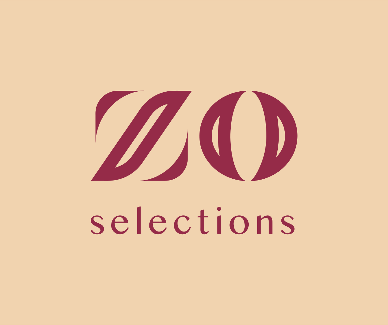
The ZO: a Z drawn as two folded leaves and an O cut by meridians, with “selections” below in a light, widely tracked lowercase. Cream on maroon first; rose maroon on cream; white on dark photography. The monogram alone where the word would not hold: a map pin, a favicon, a stamp. About one ZO height of clear space all round. Vectorised from the kit’s own export (IoU 0.997 against it), never redrawn, and never beside the Zostel symbol.

The lockup, cream on maroon
The lockup, cream on maroon The primary: the ZO over “selections”. SVG PNG
The lockup on cream
The lockup on cream Rose maroon on cream, as the kit inverts it. SVG PNG
The monogram
The monogram The ZO alone, where the word would not hold. SVG PNG
The monogram in white
The monogram in white On dark photography and as lit letters. SVG PNG
The sparkle
The sparkle Cream over gold, an accent: never in place of the mark. SVG PNG

Every colourway, with the Zostel and Zo World marks: the Logo page.

Colour

Four colours, named by what they do: maroon is the ground, cream the ink on it, rose maroon the mark on cream, gold is metal only. Each is an exact fill of the kit’s export. None of Zostel’s colours belongs here.

Maroon #6E102A ground. The ground: the logo tile, door hangers, coasters, cushions, towels, dark web surfaces. The mark sits on it in cream.
Cream #F1D3AF ink. The ink on maroon (the mark, the words); the paper when the ground is light; the sparkle's upper half.
Rose maroon #952B48 ink on light. The mark on cream: the kit's inverted tile draws it lighter and pinker than the ground maroon.
Gold #9D6E35 accent. Metal only: the sparkle's lower half, brass and halo-lit signage. Never a text colour, never a surface (it reads 2.66:1 on maroon and 3.11:1 on cream).

The tones of its patterns

The kit uses these without naming them: the grounds and raised tones of its tone-on-tone patterns and its room cards. Where two are a few units apart, both are listed as the kit has them.

Plum #480C12
Plum (room card stripes) #491117
Soft plum #4F161C
Deep wine #6F222A
Wine #822B34
Rose #94323C
Light rose #973C45
Dim rose #7A3138
Bright gold #AA7B42

Pairs that read

  • Aa Cream on maroon · 8.29:1 (AAA) · the primary pair: the mark and every word on maroon
  • Aa Maroon on cream · 8.29:1 (AAA) · words on cream
  • Aa Rose maroon on cream · 5.40:1 (AA) · the mark on cream; accents on cream
  • Aa Wine on cream · 6.26:1 (AA) · the monogram repeat and words on cream
  • Aa Cream on wine · 6.26:1 (AA) · the room-number cards
  • Aa Cream on rose · 5.28:1 (AA) · the sparkle door hanger's line
  • Aa Cream on plum · 10.98:1 (AAA) · words on the tone-on-tone grounds; the night ground
  • Aa Cream on deep wine · 7.57:1 (AAA) · words on the leaf lattice's ground

Never for words

  • Aa Gold on maroon · 2.66:1 · fails even as a graphic (3:1): gold on maroon is the sparkle's half only, beside cream
  • Aa Gold on cream · 3.11:1 · a graphic at most
  • Aa Bright gold on cream · 2.61:1 · the capsule pattern's slivers: texture, never information
  • Aa Light rose on maroon · 1.72:1 · tone on tone: texture only
  • Aa Rose on maroon · 1.57:1 · tone on tone: texture only

The tokens: zo-selections-tokens.json · zo-selections-tokens.css

Patterns

Six patterns from the kit, all built from the mark: the monogram repeat, the Z’s leaf as a lattice, the sparkle, and the line lattices of capsules, circles and the arc chain. Each is a seamless tile, vectorised from the kit’s own export, in the colourways the kit shows. One pattern to a surface, kept off the words; tone on tone by default.

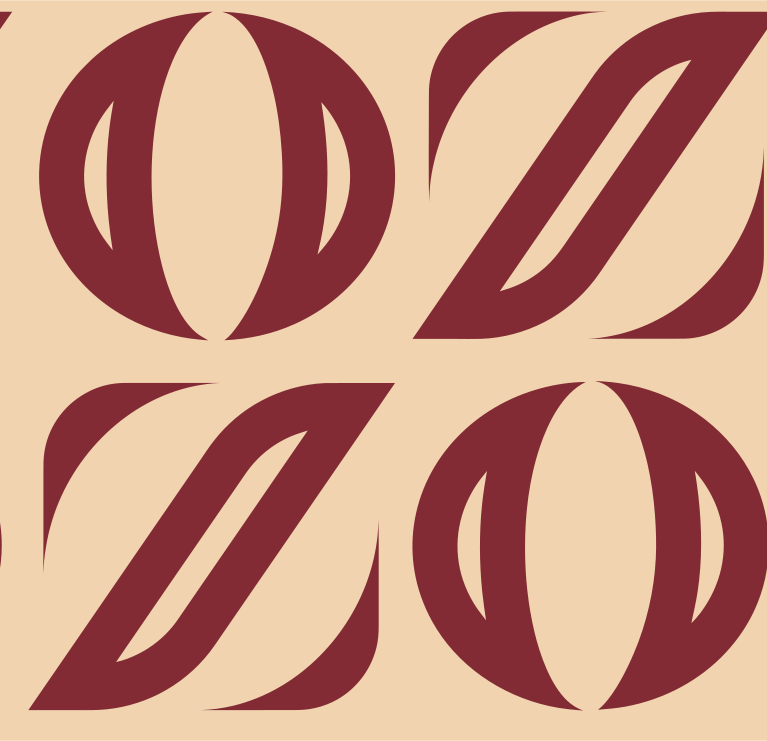
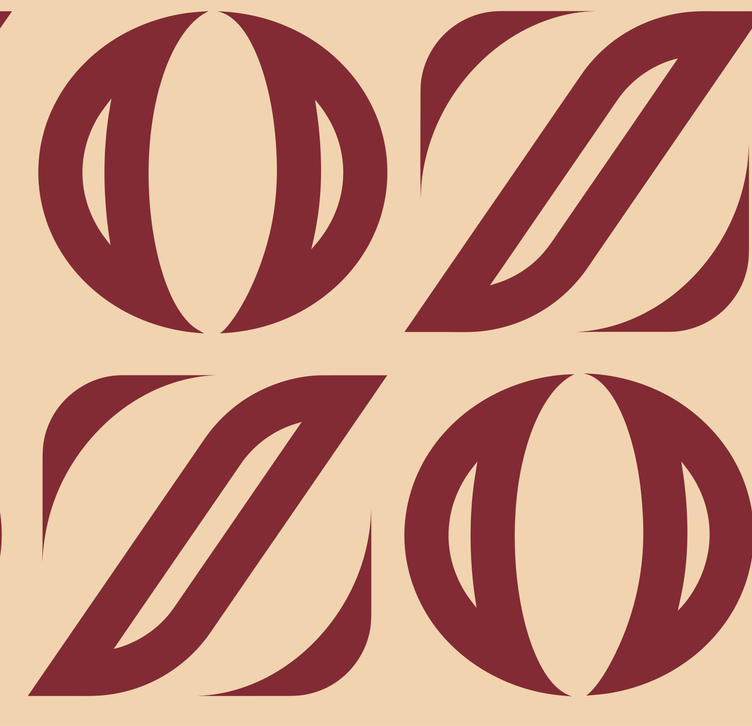
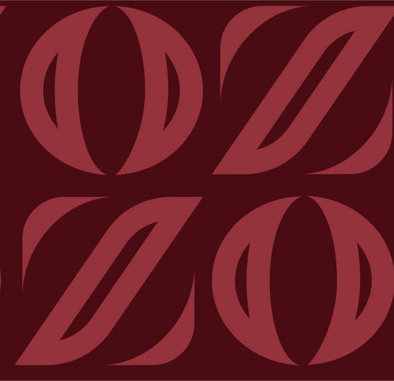
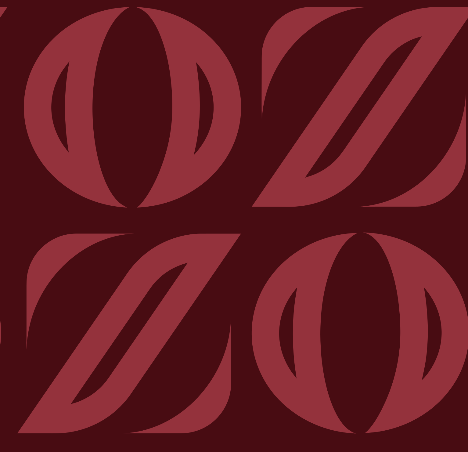
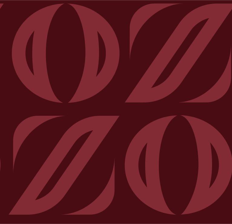
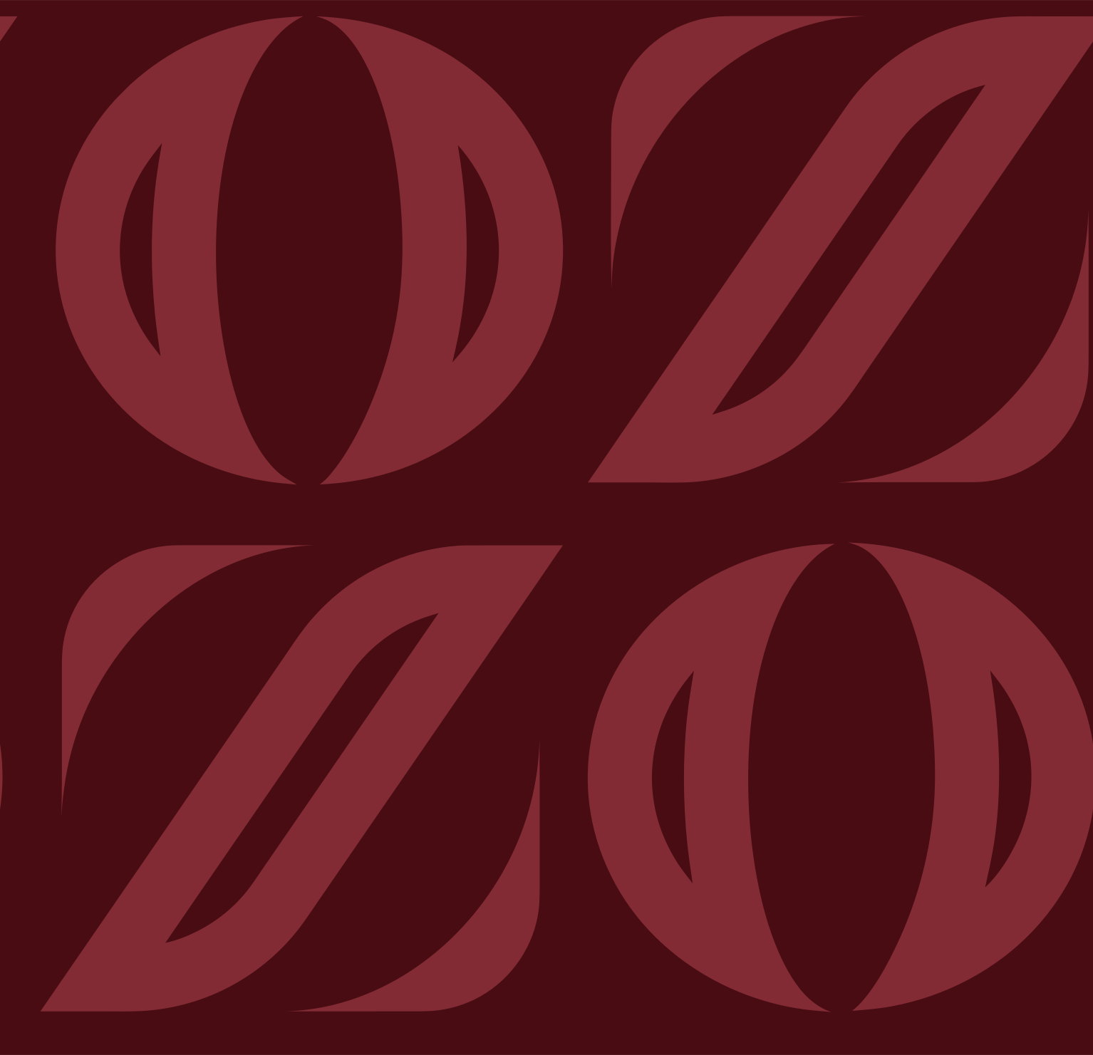
Monogram repeat

The mark's Z and O alternating, row on row, each row starting with the other letter.

Wine on cream SVG PNG
Tone on tone SVG PNG
Wine on plum SVG PNG

Tile 767.2 × 740.6 px. Its shapes against the kit: IoU 0.984–0.998; seamless. The kit places some copies off its own repeat by hand; the tile keeps the even repeat.
Leaf lattice

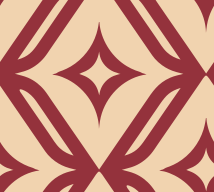
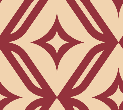
The Z's leaf strokes crossing as X's, a sparkle in every diamond between them.

Tone on tone SVG PNG
Rose on cream SVG PNG

Tile 214.0 × 192.0 px. Its shapes against the kit: IoU 0.983–0.997; seamless.

Sparkle

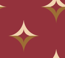
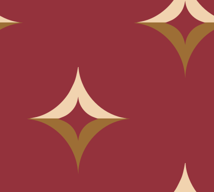
The four-pointed sparkle on a diamond grid, lighter above its middle than below, like a lit facet.

Tone on tone SVG PNG
Cream and gold on rose SVG PNG

Tile 214.0 × 192.0 px. Its shapes against the kit: IoU 0.985; seamless.

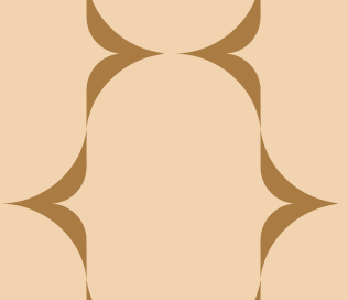
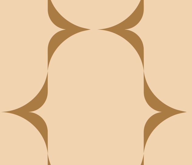
Capsules

Columns of capsules half a step apart; only the slivers of ground between them are drawn.

Cream on maroon SVG PNG
Gold on cream SVG PNG

Tile 316.0 × 272.0 px. Its shapes against the kit: IoU 0.987–0.989; seamless. The kit places some copies off its own repeat by hand; the tile keeps the even repeat.
Circles

Rounds in a grid; between each four, a star of crescents in cream and rose by turns, like light and shade.

Cream and rose on maroon SVG PNG
Rose on cream SVG PNG
Cream on rose SVG PNG

Tile 138.0 × 155.0 px. Its shapes against the kit: IoU 0.993; seamless. The kit places some copies off its own repeat by hand; the tile keeps the even repeat.
Arc chain

Crescents back to back, two rows deep: a band the kit runs across the top and the foot of a plain maroon field.

Tone on tone SVG PNG

Tile 292.0 × 227.4 px, repeats sideways (a band). Its shapes against the kit: IoU 0.961–0.969; seamless.

Type

Three voices in the kit: the wordmark’s light, widely tracked lowercase; its lines, which read as the same family a weight up (a question still open); and a display serif for numerals, in two cuts. The kit’s export doesn’t name its faces. Measured against open and specimen fonts, the nearest is Canela, a commercial family: a likeness to confirm, not a name to use yet. Until it is named and licensed, this page sets Zo Selections in a system serif, and never in Zostel’s Futura.

The word selections in the lockup, in rose maroon on cream
The wordmark: wedge-cut heads on l, t and n, no foot serifs, a round dot.
The line Quiet Luxury, Bold Spirit. on the kit's rose door hanger
The lines: read as the wordmark’s construction a weight up; sentence case, a full stop.
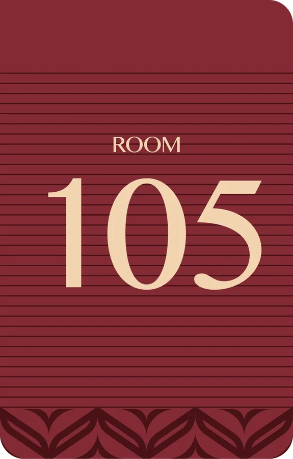
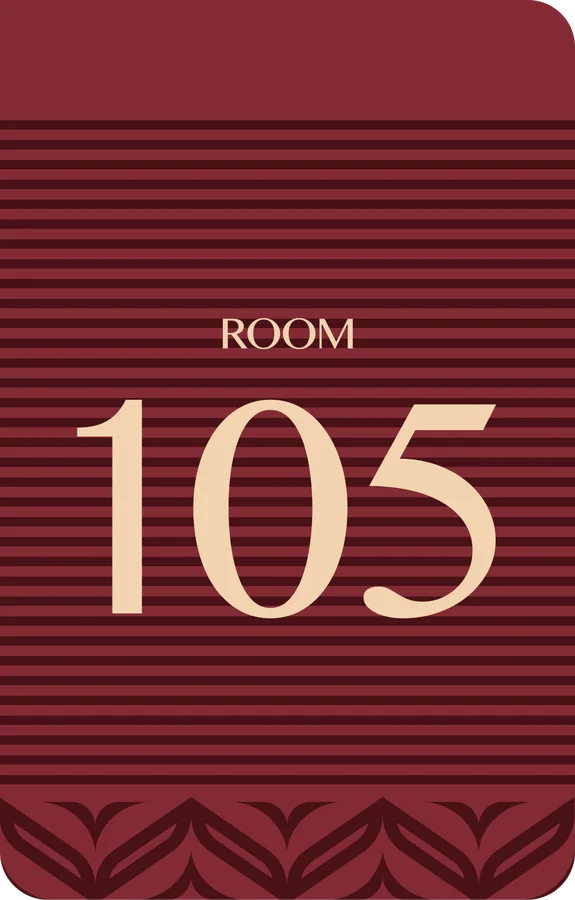
ROOM 105 on the kit's striped room-number card
The numerals: a high-contrast display serif, a 1 with no foot.

In use, from the kit

The kit draws its things in its own language: door hangers with its three lines, room numbers between leaf friezes or on pinstripes, a column of leaves for the ROOM sign. Ornament lives in borders and bands; the message sits on a plain field.

Door hanger: “Live the Art of Escape.”, the ZO tone on tone, a ZO band at the foot
Door hanger: “Elevate Every Moment.”, the leaf lattice in rose on cream
Door hanger: “Quiet Luxury, Bold Spirit.”, sparkles in cream and gold on rose
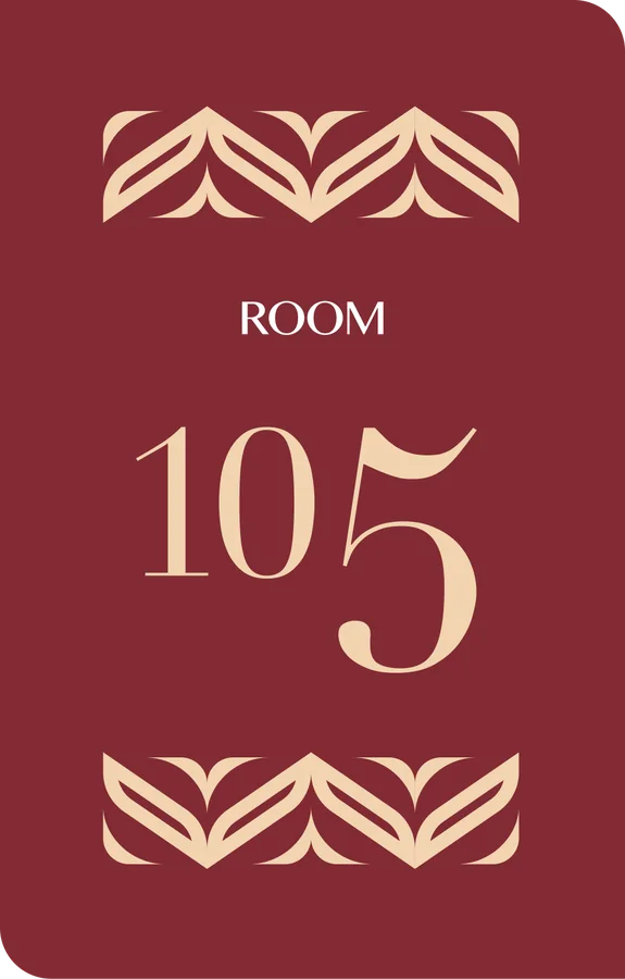
Room number: ROOM 105 between two leaf friezes, cream on wine
Room number: ROOM 105 on pinstripes, a leaf frieze at the foot
Room number: ROOM 105 on hairlines, a leaf frieze at the foot
The leaf column: the Z's leaves stacked in a framed strip (the ROOM sign's side)
The compact ZO in cream on the leaf herringbone, tone on tone
The leaf herringbone in one tone on plum

On a map

A Zo Selections home is marked with the cream monogram on a maroon disc, the same size as a Zostel home’s disc, so the homes read as equals. The ZO is set as large as holds as much ink as the six-Z on a Zostel disc. No ring and no glow on a light ground; a white ring where the ground is dark or busy.

SVG PNG Ringed SVG Ringed PNG
The Zo Selections home marker: the cream monogram on a maroon disc
On a light map
The home marker ringed in white, for a dark map
Ringed, on a dark one

What comes next

The elements Zo Selections needs, in the order its brand foundation gives them. Each one in the kit’s language, its colours and its patterns.

  1. Map home marker · made
    A maroon disc with the cream monogram, the same size as a Zostel home.
  2. Social posts and stories
    Photo first, the mark small in cream; one kit line on a maroon field for text posts.
  3. Signage and room numbers
    The lockup with the place outside; maroon panels and the kit’s two room-number layouts inside.
  4. Key cards
    The monogram repeat tone on tone, the mark on the back.
  5. In-room cards
    The three door hangers as drawn, a welcome note, the house guide.
  6. Menus
    Cream paper, maroon type, the arc chain top and foot.
  7. Email
    A maroon header with the lockup over a cream body.
  8. Web theme · made
    Its tokens on its pages; this page is the first.
  9. Motion
    The ZO drawn in one line; the sparkle catching the light. Slow and small.
  10. Place kits
    Each property: the lockup with its place, its photographs, one local material.