








Empty State
Nothing here yet, said the brand's way: one drawing from the brand library, picked by key so it follows every redraw, a title, a line and the way on. Ready presets for an empty list, a search with no results and no network. No state of its own, so it renders on the server.
Preview
A section with nothing in it yet

No trips yet
Every trip starts with an empty backpack. Pick a place, then pack.
The three presets
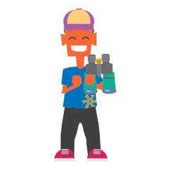
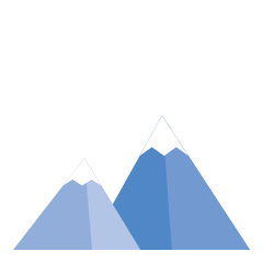
You’re offline
No signal up here. Enjoy the view — we’ll reconnect when you’re back.
Any drawing from the library, by key — a place’s own pattern, or none
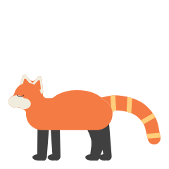
No sightings yet
Quiet in the forest today.
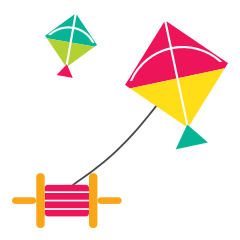
No kites up
Come back for Makar Sankranti.

No quests yet
Start one, and the crew will follow.
Usage
import { EmptyState } from "zostel-ui";

// a ready state, with its drawing and words
<EmptyState preset="no-results" action={{ label: "See every place", href: "/destinations" }} />

// any drawing from the brand library, by key, and your own words
<EmptyState
  drawing={{ set: "fauna", key: "red-panda" }}
  title="No sightings yet"
  body="Quiet in the forest today."
  action={{ label: "Try again", onClick: retry }}
/>

// in a product app on another host: the drawings come from the brand site
<EmptyState preset="empty" base="https://brand.zostel.com" />
Props
| Prop | Type | Default | Description |
|---|---|---|---|
preset | "empty" | "no-results" | "offline" | — | A ready state, with its drawing and words (the table below). Any prop overrides its part. |
drawing | { set: "kit" | "fauna" | "city" | "culture"; key: string; version?; variant? } | — | A drawing from the brand library, by key: kit = the detailed icons; fauna and city take version "colour" | "grey"; culture takes a variant (colour, tile, roundel, keycap, sticker, symbol). |
src | string | — | Any picture instead (a URL). Wins over drawing. |
drawingLabel | string | — | Names the drawing for screen readers. Without it the drawing is decorative (alt="" and hidden). |
pattern | PatternKey | false | "khovar" | The brand pattern on the round plate behind the drawing, tone on tone and never behind the words. A place’s screen wears its own (jaipur → "leheriya"); false = no plate. |
eyebrow | ReactNode | — | A small line above the title, e.g. "404". |
title | ReactNode | — | The headline, in Futura: short, sentence case. |
body | ReactNode | — | One or two short lines in the brand voice, in muted grey. |
action | { label; href } | { label; onClick } | ReactElement | — | The way on: an orange-ink button, a link (href) or a button (onClick), never both (the kit’s ActionButton; the href passes through safeHref). A ready element is shown as it is. |
secondaryAction | { label; href } | { label; onClick } | ReactElement | — | A second, quieter way on: a Beige button. |
size | "sm" | "md" | "lg" | "md" | sm in a card or a list, md in a section, lg for a whole page. |
titleAs | "h1" | "h2" | "h3" | "h4" | "p" | "h2" | The title’s element, so it sits in the page’s outline. |
base | string | "" | Where the brand files live: "" is the same origin; a product app passes the brand site. |
className | string | — | More classes, merged with the component’s own (tailwind-merge). |
preset"empty" | "no-results" | "offline"A ready state, with its drawing and words (the table below). Any prop overrides its part.
drawing{ set: "kit" | "fauna" | "city" | "culture"; key: string; version?; variant? }A drawing from the brand library, by key: kit = the detailed icons; fauna and city take version "colour" | "grey"; culture takes a variant (colour, tile, roundel, keycap, sticker, symbol).
srcstringAny picture instead (a URL). Wins over drawing.
drawingLabelstringNames the drawing for screen readers. Without it the drawing is decorative (alt="" and hidden).
patternPatternKey | false"khovar"The brand pattern on the round plate behind the drawing, tone on tone and never behind the words. A place’s screen wears its own (jaipur → "leheriya"); false = no plate.
eyebrowReactNodeA small line above the title, e.g. "404".
titleReactNodeThe headline, in Futura: short, sentence case.
bodyReactNodeOne or two short lines in the brand voice, in muted grey.
action{ label; href } | { label; onClick } | ReactElementThe way on: an orange-ink button, a link (href) or a button (onClick), never both (the kit’s ActionButton; the href passes through safeHref). A ready element is shown as it is.
secondaryAction{ label; href } | { label; onClick } | ReactElementA second, quieter way on: a Beige button.
size"sm" | "md" | "lg""md"sm in a card or a list, md in a section, lg for a whole page.
titleAs"h1" | "h2" | "h3" | "h4" | "p""h2"The title’s element, so it sits in the page’s outline.
basestring""Where the brand files live: "" is the same origin; a product app passes the brand site.
classNamestringMore classes, merged with the component’s own (tailwind-merge).
The presets
| Prop | Type | Default | Description |
|---|---|---|---|
"empty" | kit · backpack | — | Nothing here yet — Every trip starts with an empty backpack. Add the first thing. |
"no-results" | kit · one-zobu-binoculars | — | No results — Nothing matches that yet. Try another word, or a place nearby. |
"offline" | kit · mountain | — | You’re offline — No signal up here. Enjoy the view — we’ll reconnect when you’re back. |
"empty"kit · backpackNothing here yet — Every trip starts with an empty backpack. Add the first thing.
"no-results"kit · one-zobu-binocularsNo results — Nothing matches that yet. Try another word, or a place nearby.
"offline"kit · mountainYou’re offline — No signal up here. Enjoy the view — we’ll reconnect when you’re back.
Where the drawings come from
Every key is a file the brand tools generate, so a redrawn drawing reaches every empty state by itself. kit — the detailed icons on /icons. fauna — the animals on /illustrations. city — the city symbols, named place-symbol (e.g. jaipur-kites), on /illustrations and each place’s page. culture — the culture symbols on /zo-keyboard.
Pick a drawing that says the moment: a backpack for an empty list, Zobu with binoculars for a search, a mountain for no signal. The words say what to do next, in a verb.
The drawing sits on a round plate that wears a brand pattern at a whisper, tone on tone and never behind the words (brand/README.md §8, one pattern per surface): EmptyState wears khovar, NotFound jaali (the symbol’s own lattice), ZobuLoader gond scales. On a place’s screen, pass the place’s own (Jaipur wears leheriya); pattern={false} drops the plate.