








Zobu Loader
A loading state with Zobu in it: a palette Zobu waves (or hops) while something loads. The animation is the brand's own file, picked by key, so a new skin reaches every loader by itself. Under reduced motion the browser shows the still pose, with no script; the words are a polite live status.
Preview
Zobu waves while it loads

A place’s Zobu, waving or hopping
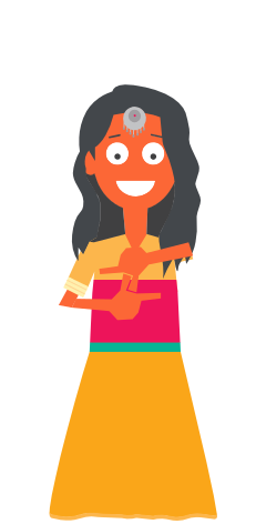
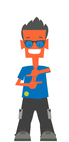
Sizes — the words for screen readers only; the last with no plate
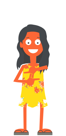
In use: press the button
Usage
import { ZobuLoader } from "zostel-ui";

{loading && <ZobuLoader label="Finding beds in Jaipur…" />}

// a place's Zobu, hopping, the words for screen readers only
<ZobuLoader zobu="bir-male" state="hop" size="sm" hideLabel label="Loading" />

// in a product app on another host: the Zobus come from the brand site
<ZobuLoader base="https://brand.zostel.com" />
Props
| Prop | Type | Default | Description |
|---|---|---|---|
zobu | string | "zobu" | Which palette Zobu: "zobu", or a place’s pair, e.g. "jaipur-female", "bir-male" (every key is on /characters). |
state | "hello" | "hop" | "hello" | hello = a wave on a 4 s loop; hop = a hop on the beat, 1 s. |
label | ReactNode | "Zobu is on it…" | What is happening, in words: a polite live status for screen readers, shown under Zobu unless hideLabel. |
hideLabel | boolean | false | Keep the words for screen readers only. |
size | "sm" | "md" | "lg" | number | "md" | Zobu’s height: 96, 160 or 240 px, or any number of px. The width follows the shared frame (231 × 472), so nothing shifts. |
pattern | PatternKey | false | "gond-scales" | The brand pattern on the capsule behind Zobu, tone on tone. A place’s screen wears its own (jaipur → "leheriya"); false = no plate. |
base | string | "" | Where the brand files live: "" is the same origin; a product app passes the brand site. |
className | string | — | More classes, merged with the component’s own (tailwind-merge). |
zobustring"zobu"Which palette Zobu: "zobu", or a place’s pair, e.g. "jaipur-female", "bir-male" (every key is on /characters).
state"hello" | "hop""hello"hello = a wave on a 4 s loop; hop = a hop on the beat, 1 s.
labelReactNode"Zobu is on it…"What is happening, in words: a polite live status for screen readers, shown under Zobu unless hideLabel.
hideLabelbooleanfalseKeep the words for screen readers only.
size"sm" | "md" | "lg" | number"md"Zobu’s height: 96, 160 or 240 px, or any number of px. The width follows the shared frame (231 × 472), so nothing shifts.
patternPatternKey | false"gond-scales"The brand pattern on the capsule behind Zobu, tone on tone. A place’s screen wears its own (jaipur → "leheriya"); false = no plate.
basestring""Where the brand files live: "" is the same origin; a product app passes the brand site.
classNamestringMore classes, merged with the component’s own (tailwind-merge).